Tuesday, 20 May 2014

Going with gold in the playoffs

The Indiana Pacers wore their gold alternate uniform at home in game 1 of the Eastern Conference Finals on Sunday, which continued a trend in these playoffs. The Pacers have gone with gold for game 1 home games in all three series they’ve played. 
The Pacers and Heat in their alternates


Further driving home the effect, the Heat wore their red alternates in game 1 in Indiana. Wearing an alternate uniform often in the postseason isn't something to be condemned, but it doesn't seem right.

An alternate should generally be worn infrequently. Excessive alternate wearing makes both the primaries and the alternate less special. If teams didn’t overwear their alternates, it’d be more noteworthy when they did play in them, meaning there might be less desire for nickname games, Christmas uniforms and other such folly. So wearing them often, whether in the regular season or playoffs, is unwise.

On top of that, alternates don’t fit the occasion of the playoffs. Playoff games are distinctive – maybe not as much as in the NFL or other postseasons with fewer games, but they’re uniquely important nonetheless. It seems right to wear primaries – the uniforms that are essential for every team and are worn the most during the regular season – at such times.

In the case of the Pacers, who have worn all three of their uniforms this postseason, their movement towards their alternate could be connected to their gold-clad fans. Hopefully the decision to wear gold wasn’t dictated by a desire to have the players match the colour of the crowd, whose giveaway shirts were understandably gold, which is more distinctive than blue or white. But the Pacers have also worn gold on the road these playoffs, so maybe they’re just fond of it.

There are factors that support the alternate prominence. If a third uniform deserves to exist in the first place, as is the case with Indiana, then it’s unreasonable to consider it unacceptable for the playoffs. Although alternates carry a waft of needlessness, they aren’t really less legitimate than primaries. Some team individuality is good, too: having everyone stick to a rigid no-alternates policy in the playoffs would be unwelcome.

The Pacers’ gold uniform is also the best in their current set. It has issues – the side stripes are unsightly, the collar is iffy and the two logos on the shorts are excessive – but compared to what the Pacers wore in their previous seasons of reaching the East finals in the NBA (1993-94, 1994-95, 1997-98, 1998-99, 1999-00, 2003-04, 2012-13), it’s great. Indiana wearing their alternate multiple times in the playoffs might seem a bit off, but at least that third uniform is an improvement on the one worn in their pinstriped days.
Tuesday, 6 May 2014

Who could follow Atlanta by reviving old logo

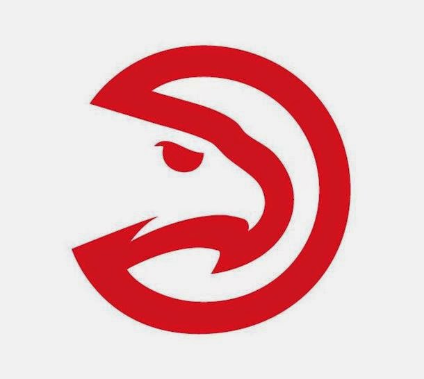
The Atlanta Hawks’ new secondary logo doesn’t belong. The revised version of their 1972-95 logo isn’t a natural fit with their current primary, which is staying put, and doesn’t gel with the Hawks’ generally busy look.

But it is a good logo, albeit mildly inferior to the original version. It’s now easier to recognise the hawk, thanks to the neck detail, the curvier beak and the meaner eye. Those changes slightly subtract from the strongpoints of the original: its simplicity and vagueness. The Hawks emphasised how the
The new Hawks secondary logo
old logo could be confused for something else by referring to it as the “Pac” logo. This potential for misinterpretation was part of the logo’s appeal.

It’s still attractive though, and maybe more simplicity will do Atlanta good. Being a secondary logo that was just introduced, it’s tough to tell how prominently it’ll be used: it might end up largely unseen apart from fan merchandise.

There aren’t many other NBA teams that are good candidates for a similar logo restoration. Dallas, Houston, Milwaukee and Minnesota all have primary logos from their past that could be returned with minimal or no tweaking. But those four teams would benefit much more from an overhaul to accompany the logo resurrection, as opposed to just adding an old logo to the fray, like Atlanta did.

The two teams best suited to following Atlanta are Philadelphia and Phoenix. The 76ers could return their 1963-77 primary as a secondary logo. It’s an obvious fit with their current logos. Importantly, it’s simple, which would be a nice alternative to the annoyingly clunky primary they use now.

The Suns could bring back a slightly altered version of their 1968-92 secondary. It’s a slightly random but charmingly simple logo that could fit their current look with some tweaking of the font and colours. As a bonus, it could replace Phoenix’s current, unsightly secondaries. Like the Hawks’ new secondary – but unlike the 76ers suggestion above – this Suns logo wouldn’t really fit with the team’s uniforms. But with so many potential locations for secondaries, that’s no problem.